
I made this because 1) I wanted to see what it looked like and 2) I think it’s kinda important. Talking about red states versus blue states in a monolithic way is reductive and annoying.
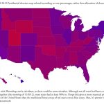
Several people have asked how this was done. The numbers were taken from MSNBC. I matched the percentage of blue in an RGB color picker to the percentage of the vote Barack Obama got and did the same for Romney
and red. Green stayed at zero.So if a state had voted 100% for one or the other, you would see the bluest blue or reddest red your computer screen can produce. The reason all the colors are more or less in the middle is because no state went more than ~70% for one side or the other. Although if you zoom in you can see that DC is very bright with 91% for Obama.
A few people mentioned that they’d like to see this done by county. Personally I don’t think the county map would be that useful unless it reflected the population disparity between counties (which is harder, but maybe possible). I’m thinking about it.
(via Cousin Cole)